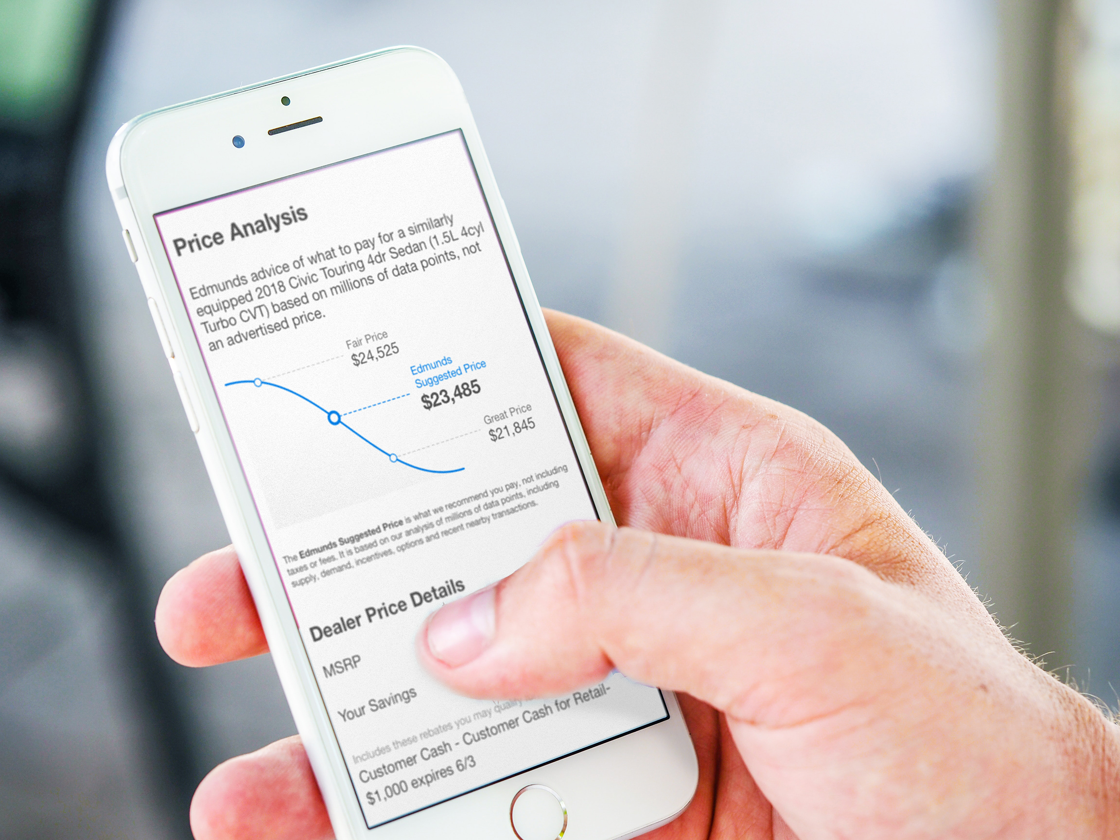
The Challenge
In early 2019, Edmunds.com made a significant change to how vehicle prices were displayed on their site. Previously, visitors could only see the actual price of a vehicle after providing their contact information, with the listed retail price crossed out. But as user satisfaction and usability metrics declined, it became clear that a more transparent approach was needed. The new system displayed actual prices directly on all vehicle detail pages.
Transitioning to this new model took nearly a year, involving detailed adjustments across the business. One major challenge emerged: how do we help users understand if a vehicle’s price is a "good" or "fair" deal? Our goal was to provide clarity for car shoppers, helping them feel confident they were getting a good deal when using Edmunds.com as their guide.
The Process
Reimagining the Bell Curve
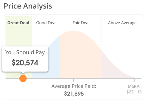
When I joined the project, the existing design used a bell curve graphic to illustrate what people nearby had paid for a given vehicle, highlighting average and full retail prices. While functional, the graphic had issues: it was bulky, off-brand, and users struggled to understand its purpose. Another point of contention was the "You Should Pay" label. It appropriately anchored price expectations, but the Product team believed we could do a better job with a more clearly branded label.
Working with our branding team, we created five new design concepts, narrowed down to four for testing, and gathered feedback from a nationwide survey using a quantitative research vendor. Participants evaluated each design within the context of a vehicle detail page, identifying which prices seemed like good deals and ranking the graphics on readability and overall appeal.
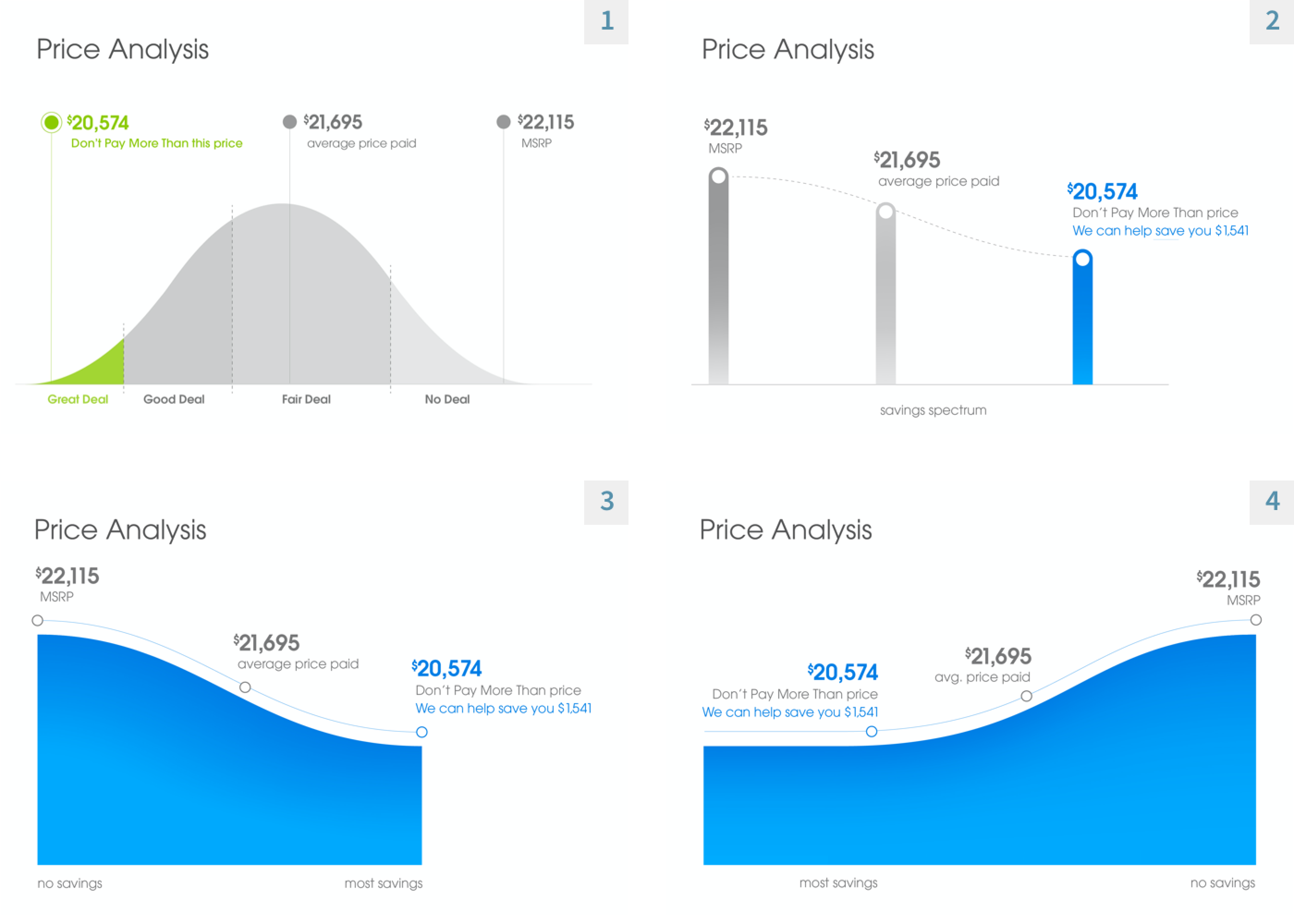
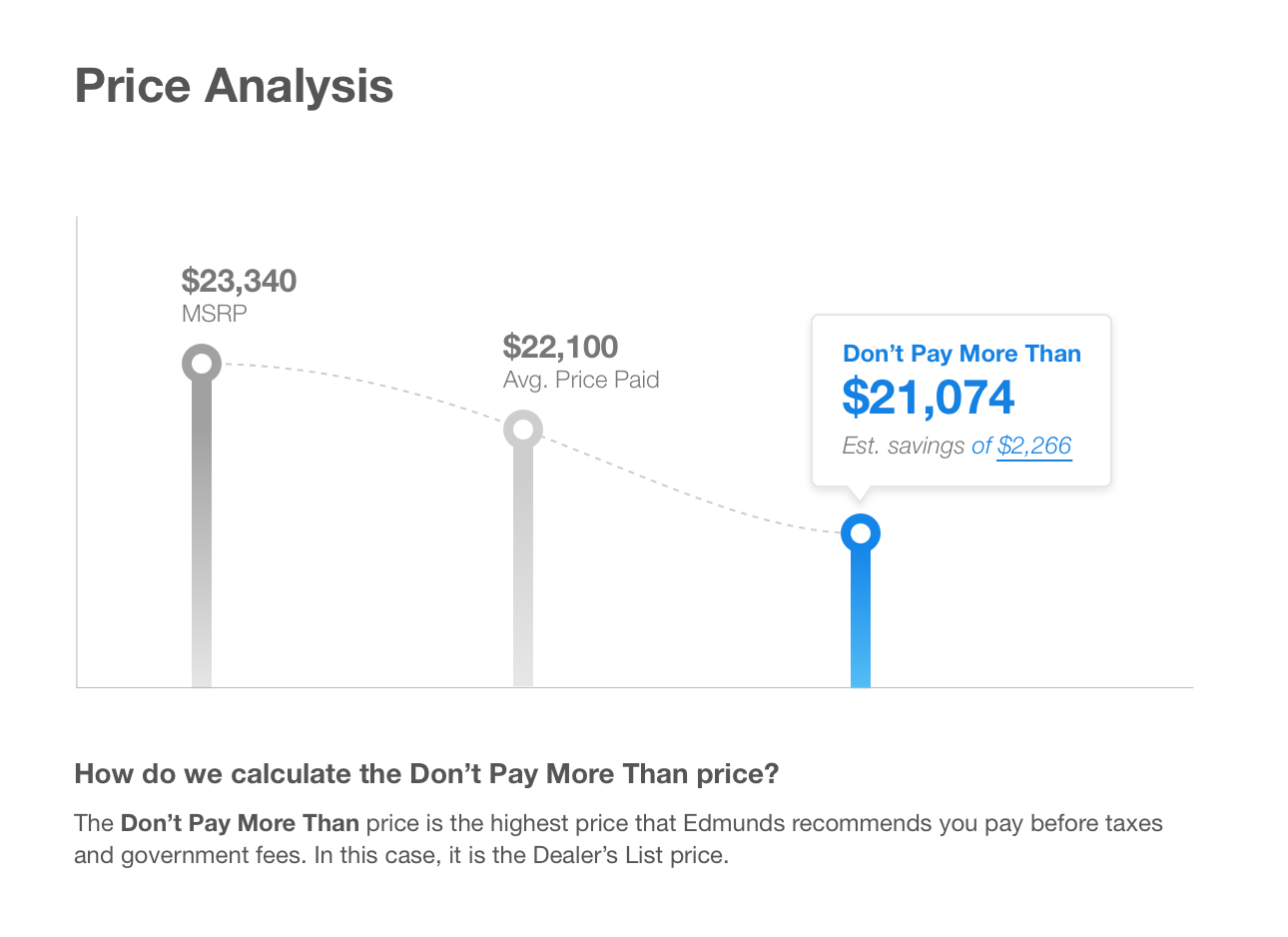
While the original bell curve performed surprisingly well, a new design (Challenger 2) outperformed it in almost every category. I refined the details with input from the design, product, and development teams, and we rolled out a new graphic that clarified two key pieces of information: the “Don’t Pay More Than” threshold and “Estimated Savings”, emphasizing Edmunds’ value in the car-buying process.
Two steps forward, one step back
The new graphic performed well for new cars, but it didn’t account for several scenarios. For used vehicles, there’s no official price, making savings calculations less reliable. Additionally, some new car listings had unexpected data that caused the graphic to break. These edge cases led to confusing displays and undermined user trust.
Short-term Fix: We adjusted the logic to exclude the graphic for used cars while we continued working on a comprehensive solution.
Long-term Goal: Create a single, adaptable graphic that could serve both new and used car shoppers. I took on this challenge personally, exploring new ideas, gathering feedback from the team, and conducting informal tests with coworkers, friends, and family.
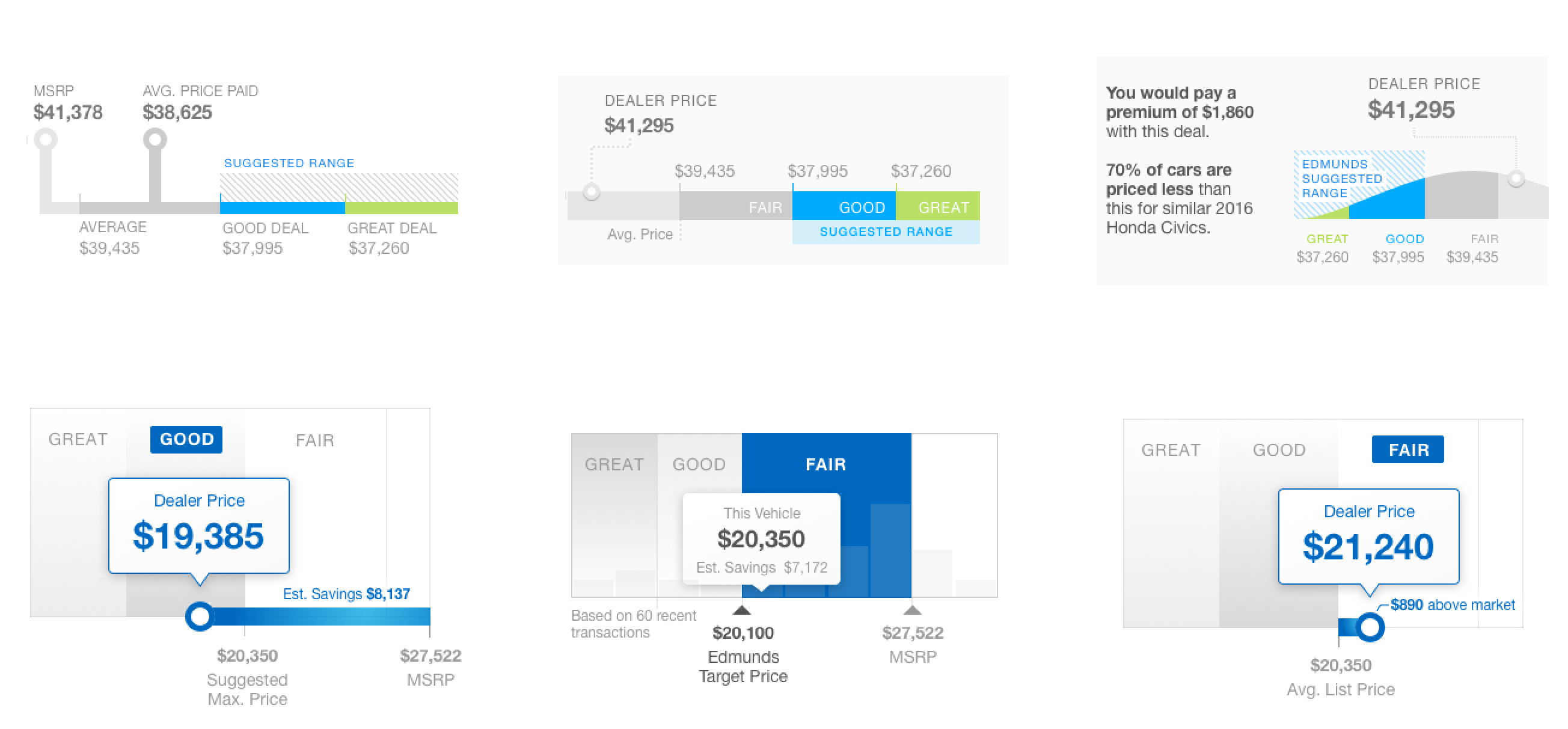
Feedback revealed that simplicity was key. Many users found many of these designs too cluttered with numbers. Even when they could understand the data, it took them longer than they’d spend in a real-world situation, highlighting the need for a more streamlined approach. The question was, if we were going to focus on one or two data points for a vehicle, what should they be?
Gaining Perspective with User Research
Realizing we needed more insight, I partnered with our UX Research team for a series of moderated remote interviews on UserTesting.com. We spoke with both new and used car shoppers, asking them to describe their strategies for finding a good deal and guiding them through an exercise where they created their own pricing visual using clip art.
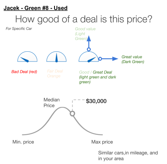
Key Insights
- Shoppers consistently said a good deal meant paying “less than what other people paid” for a similar car.
- They viewed a “Good Deal” label as a reasonable starting point for negotiation.
- More than two or three deal rating levels was too much.
With this feedback, I further iterated the design, reducing the number of data points to focus on the most important metrics. This improved usability, but also simplified the logic for rendering the graphic algorithmically across both new and used vehicles. The only piece left to fill in was the final branded pricing label.
Final Approach: More streamlined, More effective graphic
Around this time, A/B testing was underway to measure user engagement with different pricing labels, and we consulted with major auto manufacturers about their guidelines for displaying prices.
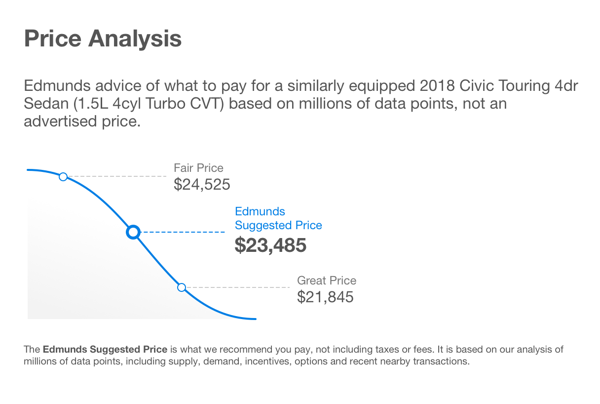
I took the best performing label and made small adjustments to integrate it into my graphic. The final design featured the Edmunds Suggested Price—branded as a “Good Deal” or “Fair Deal” depending on context. It also provided additional supporting data points for users, such as high and low price ranges, for better comparison. This flexible design allowed us to meet both user needs and automaker guidelines while reinforcing Edmunds’ brand as a trusted advisor.
The Impact
The new graphic increased conversions by up to 30%. User feedback was positive, as seen in rising Net Promoter Scores and consistent praise in usability studies. It was used across Edmunds’ site for new vehicles and used vehicles for several years.
Key Learnings
-
The path to success is not always straight: As a designer, I like to think in terms of linear progress, but real-world projects often involve unexpected turns. It’s essential to stay focused on the end goal and adapt to changing circumstances.
-
When in doubt, make sure you're asking the right questions: When uncertainty arises, it’s often because we’re not asking the right questions. Engaging directly with users helped us identify what they valued most, allowing us to focus our efforts effectively.
-
Iteration can bring clarity: As Bill Buxton says in Sketching User Experiences, sketching and prototyping help clarify your thoughts and define the problem space. Our numerous iterations allowed us to refine our approach, making the final solution stronger and more user-friendly.
